Tuck’s refreshed visual identity reflects who we are and how we show up in the world.
Sharper, bolder, and more prominent, our updated brand identity draws a clearer connection to Dartmouth and its tradition of academic excellence while bringing new cohesion to Tuck’s own identity. Our enhanced shield, refined logo system, and adoption of Dartmouth Green celebrate the vibrant history and reputation that have long set Tuck apart.
Before starting your project, please contact Tuck Marketing & Communications. We will work with you to understand your needs, answer your questions, and help you work within Tuck's brand guidelines.
Tuck employees and students can get the complete guidelines and download assets.
Jump to: Logos | Color Palette | Typography
LOGOS & BRAND MARKS
Tuck's identity is much more than a logo; however the logo is one of the most important parts of the visual expression of any brand. Tuck's logos act as a signature, an identifier, and a stamp of quality. Consistent use of logos and brand marks helps Tuck stand apart and reinforces a strong, distinctive identity.
Tuck’s logos should be displayed prominently and clearly to maximize their impact and may not be altered in any way. Only approved logos can be utilized in communications
Primary Logo
Tuck’s primary logo features ‘Tuck at Dartmouth’ paired with the Tuck shield, optimized for maximum recognition and impact. It has been designed specifically to uphold our mission, stand out in the market, and unify our brand.
Alternate Logo
An alternate version of our primary logo: this version removes the reference to Dartmouth for a simplified logo perfect for those who know us well. This logo should only be used internally or for audiences familiar with the Tuck brand (e.g. alumni, students, faculty, and staff).
Logo Lockups
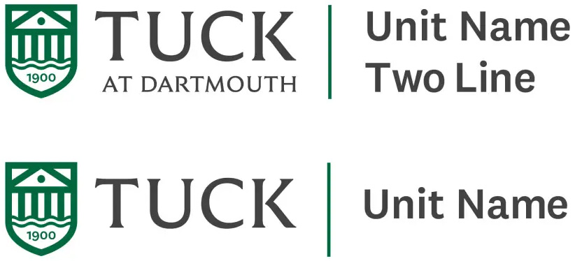
Lockups pair office, department, or center titles with either the primary or alternate Tuck logo, depending on the unit's primary audience. When using logo lockups, follow all primary logo usage guidelines, including color, clear space, and minimum size requirements. The horizontal lockup serves as the preferred option for most applications where space allows, ensuring optimal legibility.
Tuck's offices, departments, and centers should contact Marketing & Communciations for assistance with logo lockups.
Using the Logos
-
Clear Space & Minimum Size
Clear Space
Clear space is the area surrounding the logos that must be kept free of competing text or graphics. Clear space minimums (shown right as gray, dashed lines) are built into all logo files. For the primary and alternate logos, the clear space is equivalent to the width of the T in “Tuck”.Minimum Size
The Tuck primary and alternate logos should always be reproduced at a minimum of 1” or 75 pixels wide to maintain legibility in all media.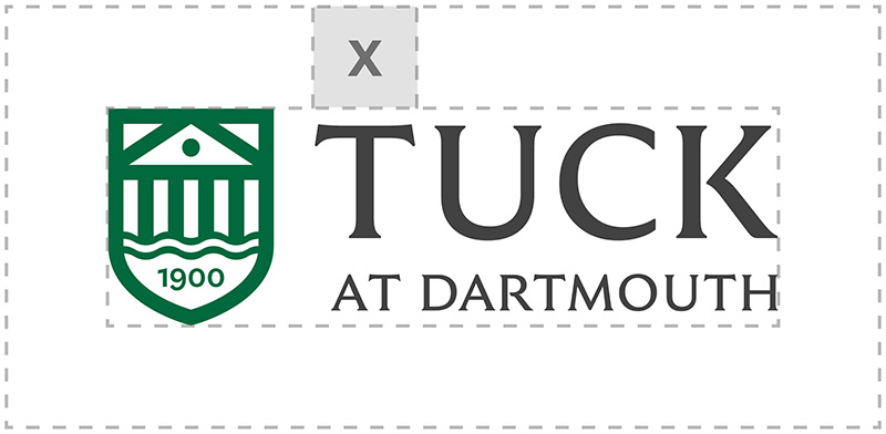
COLOR PALETTE
Much of who we are and what we cultivate at Tuck comes from the natural environment around us. Therefore, our color palette is inspired by where we study, work, and play. Carefully applied brand colors will impart a consistent look and feel to all Tuck communications and touch points.
Primary Color
Dartmouth Green is the primary color of the Tuck and Dartmouth brands and reflects our surroundings. Avoid using tints of Dartmouth Green as this will dilute our brand’s bold impact.
Dartmouth Green
PMS 349
CMYK 95/0/100/50
RGB 0/105/62
#00693E
Secondary Colors
When color beyond Dartmouth Green is needed for distinction or visual interest, secondary colors may be used, but they must not overpower Dartmouth Green.
Tuck Orange
PMS 179
CMYK 9/87/100/2
RGB 204/62/23
HEX #CC3E17
Spring Green
PMS 367
CMYK 29/0/67/0
RGB 165/215/95
HEX #A5D75F
Forest Green
PMS 627
CMYK 93/33/75/75
RGB 18/49/43
HEX #12312B
Snow White
CMYK 0/0/0/0
RGB 255/255/255
HEX #FFFFFF
Fog
CMYK 10/7/8/0
RGB 226/226/226
HEX #E2E2E2
Stone
CMYK 57/48/48/15
RGB 112/112/112
HEX #707070
Charcoal
PMS 447
CMYK 65/60/65/60
RGB 66/65/65
HEX #424141
Midnight Black
CMYK 50/50/50/100
RGB 0/0/0
HEX #000000
TYPOGRAPHY
The typefaces at the core of Dartmouth's visual brand identity are National 2 and Dartmouth Ruzicka. Tuck has adopted these typefaces as of July 2026 with nuanced use guidelines.
National 2 should be the primary choice in almost all Tuck cases, delivering clarity, strength, and prominence across communications. Dartmouth Ruzicka plays a limited, supporting role, used sparingly when a more traditional accent is needed. This disciplined typographic system reinforces our refined identity, strengthens brand recognition, and ensures a consistent, confident presence across every touchpoint.
Whether used separately or together, these typefaces work together to create a sharper, bolder, and more cohesive expression of the Tuck and Dartmouth brands.
We strongly recommend using National 2 and Dartmouth Ruzicka whenever possible. When this is not possible, we recommend alternates below.
National 2
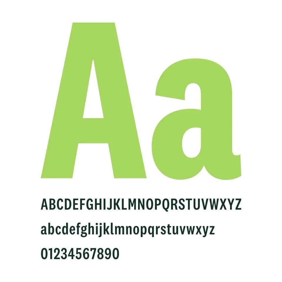
National 2 is a simple sans-serif with subtle details that give it a distinctive, but not distracting, personality. It is designed to thrive in our contemporary typographic climate. Using National 2 as the main typeface on communication materials plays up the strong, bold spirit of the Tuck brand.
USAGE: As Tuck’s primary typeface, National 2 should be used for headings, subheadings, body copy, infographics, and most other applications.
National 2 Restrictions: The font license does not allow Tuck to distribute National 2 to freelancers, vendors, or alumni (other than to printers who are working on projects for Tuck offices). National 2 can be purchased from the font foundry Klim.
ALTERNATE: Arial or Arial Narrow
Dartmouth Ruzicka
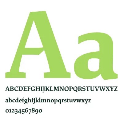
Originally designed by Rudolph Ruzicka, Dartmouth Ruzicka is a typeface that speaks to the legacy and history of Dartmouth. Type designer Jesse Ragan picked up where Ruzicka left off to modernize Ruzicka's typeface and bring it into the 21st century.
USAGE: Use Dartmouth Ruzicka sparingly for quotes, callouts, or in formal instances.
ALTERNATE: Georgia